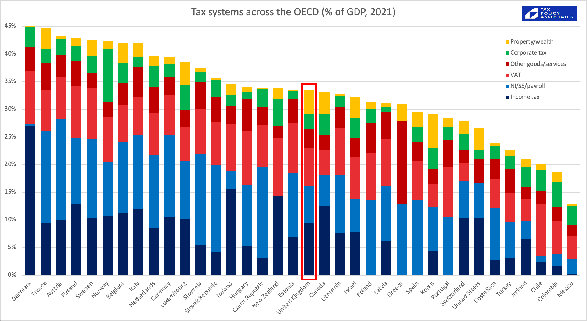
We now have the latest OECD tax data, showing tax as a percentage of GDP across the developed world.
The UK looks rather average:

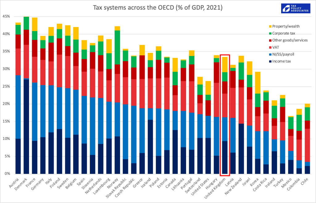
If we order by personal tax (income tax and national insurance etc), we see that UK income tax/NI is a somewhat lower % of GDP than average:
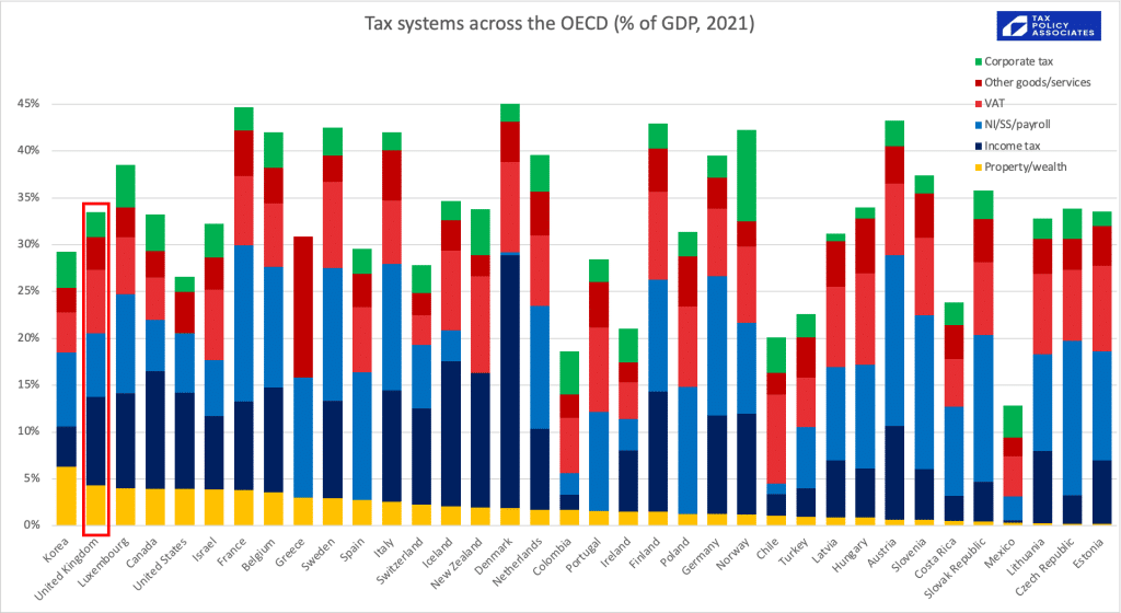
If we order by property/wealth tax, the UK surprisingly raises one of the highest %s of GDP in the world (although we should be careful about comparisons here; please see caveats below):
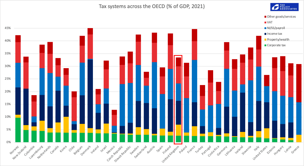
Corporate tax, the UK raises a bit less than average (although this is before the increase from 19% to 25%, which will put the UK in the top quartile):
Another way to look at the data is each tax as a % of overall tax revenues. Then the UK looks rather unexceptional, raising proportionately a bit less in personal tax than most of the world, but a bit more in property tax.
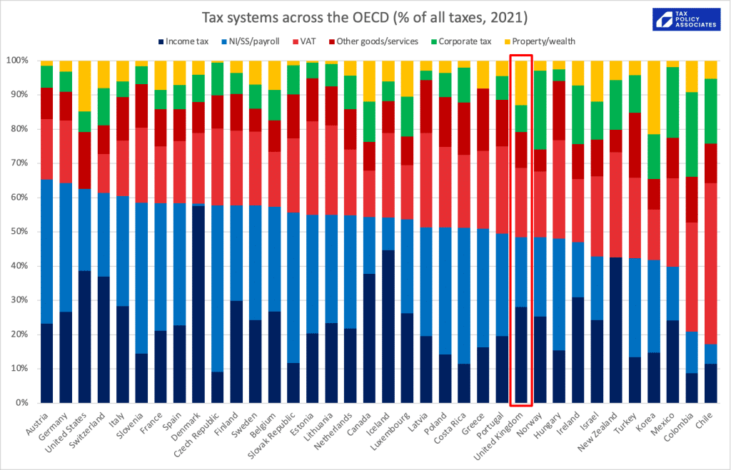
So many of the loudest voices in the tax debate are wrong. The UK is not horribly over-taxed. Wealth in the UK is not horribly under-taxed. We have a pretty typical tax system. We could tax a bit more, or tax a bit less, and there are certainly plenty of aspects of the system we could and should improve. But the case for revolutionary change often relies upon an inaccurate picture of how things are now.
The data is from the wonderful OECD global revenue statistics database⚠️ – all I’ve done is take the many different taxes and push them into categories. The spreadsheet is available here.
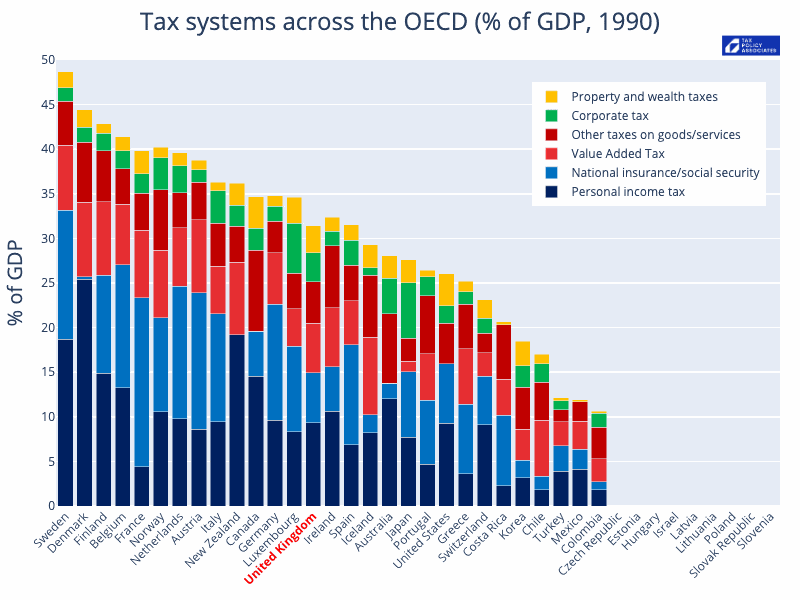
How’s it changed over time?
Like this:
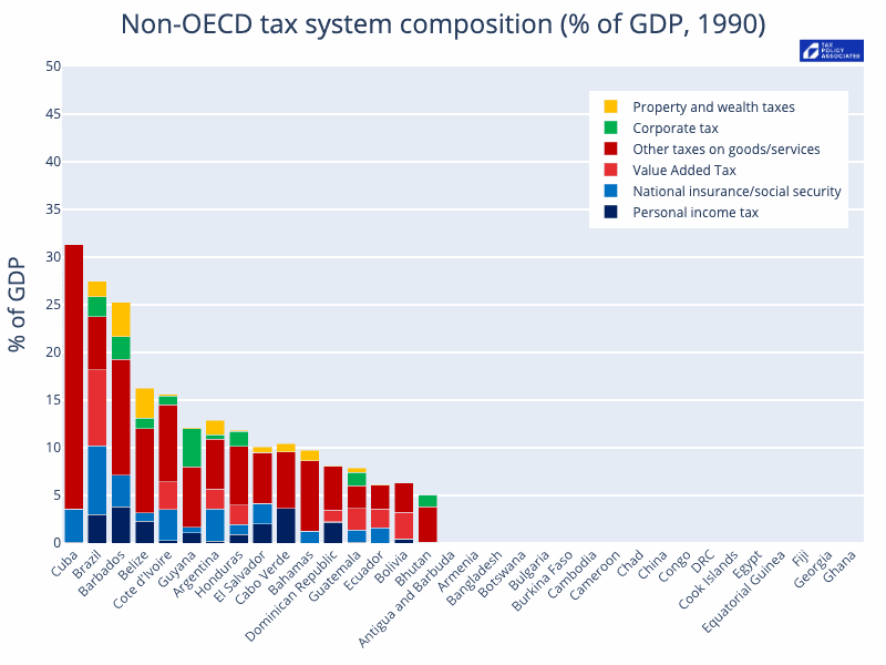
Or, for the non-OECD countries:
The code that generated these is available here.
Caveats
There are, inevitably, plenty of caveats:
- These figures include all national, state, local taxes.
- This is OECD data, and so (whilst I’m not certain) I don’t believe it will pick up the significant recent UK corrections. There may be similar data issues with other countries.
- It’s OECD only, so no Singapore (not an OECD member because it’s not a democracy).
- “Property/wealth” is a combination of capital gains tax, inheritance tax, stamp duty/land transfer taxes, council tax, and other recurrent and transaction taxes on property. This won’t quite be an apples-to-apples comparison, because property taxes in some countries pay for services which in other countries you pay for privately (e.g. garbage collection).
- “NI/SS/payroll” includes employee and employer taxes (because the economic burden ultimately falls on employees). Also includes such things as the UK apprenticeship levy. Comparisons need to be done with care because some countries have greater private pension provision, and others achieve an economically similar result with income-linked state pensions.
- Oil/gas taxation is included in “corporate tax”. You could argue it shouldn’t be; the inclusion is less a point of principle, and more because disentangling it from this dataset is hard.
- Small countries like The Netherlands, Luxembourg and Ireland (some would say “tax havens”) somewhat distort the data. Their corporate tax looks high; their GDP (particularly in the case of Ireland) is artificially inflated, so the overall level of tax looks low.
- Mexico, Colombia and Chile suffer from a large informal economy and so their personal tax revenues are relatively low, and they are disproportionately dependent on corporate tax and indirect taxes.
- Plenty of other factors complicating simple comparisons between countries, e.g. US private healthcare provision being economically akin to taxation but not showing in this dataset.
- A few countries haven’t provided recent data yet – Australia, I’m looking at you – and so are missing from the first charts. The animated chart replaces missing data with the previous year (to avoid it looking like the country has disappeared).
- GDP data is frequently subject to revisions, both corrections and changes in methodology. The OECD has kindly confirmed that the data we use here reflects all these revisions, and so it is appropriate to e.g. compare the 2021 GDP figures with the 1990 GDP figures.

The Scottish Budget – four thoughts on a tiny tax cut
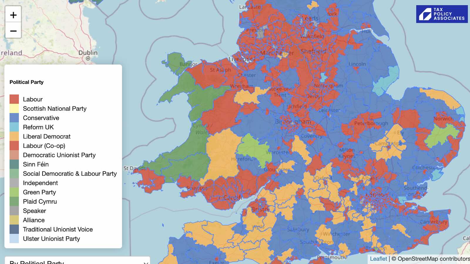
The mansion tax map: where the money comes from
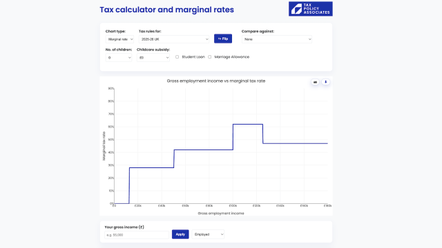
The Budget 2025 tax calculator
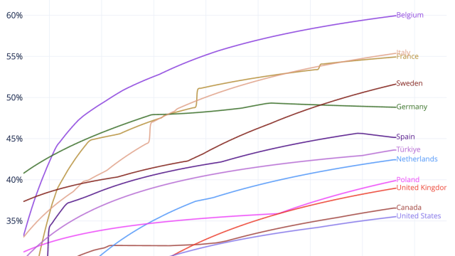
Are UK workers over-taxed? The answer in four infographics
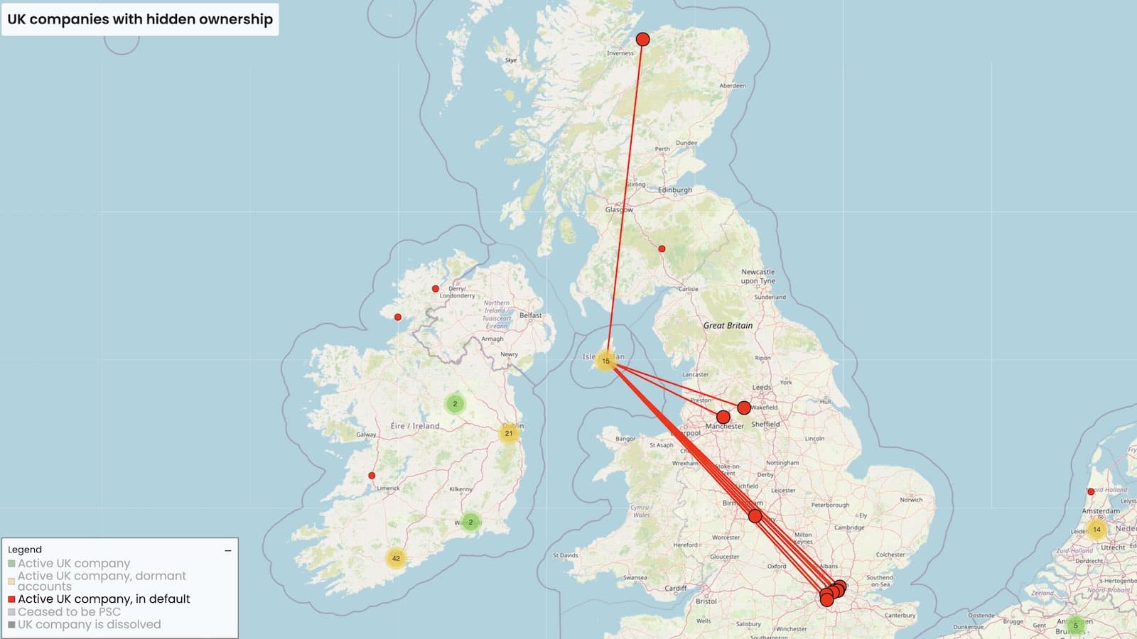
50,000 UK companies are unlawfully hiding their true owners
Leave a Reply